In good taste
The Albwardy Group brings the Taste Kitchen concept to Dubai this month, combining top quality food served in a modern setting with an industrial twist
01 May 2014
RESTAURANTS today have become a canvas for the most creative designers in the world to showcase their talent and meet the demand of diners who not only seek good food but also an ideal ambiance that creates the right mood to relax and converse.
With Taste Kitchen, renowned Gordon Ramsay-trained chefs Nick Alvis and Scott Price in partnership with the Albwardy Group have aimed to create a new relaxed family dining concept that dishes up farm-fresh food at affordable prices.
The spaces were designed by RSP’s award-winning designers and the first restaurant that has been modelled on this concept is due to open in Dubai’s Mercato Mall this month (May), with the next in the series to be launched at the Silicon Oasis Mall in June, to be followed by other outlets across the UAE.
The design was a collaborative effort between RSP, the Albwardy projects department and the Gordon Ramsay chefs. Collectively they chose a modern urban concept with an industrial twist.
|
The bar counter at the Silicon Oasis Mall. |
The client’s idea of chic, upscale food at affordable prices inspired rustic materials which everyone agreed is a rational and sensible accompaniment to honest food, says a spokesperson for RSP, whose in-house interior team have a diverse blend of global experience that gives them an edge in the UAE’s competitive interior design market.
The chefs wanted to promote the idea that ingredients used would enhance the fresh flavours and colours to emphasise ‘farm-to-table’ and traceability of ingredients. The rustic and homely restaurant is all about fresh quality ingredients with a creative touch.
The designer’s vision was to create an informal yet stylish and fashionable restaurant with an open kitchen. The addition of the juice bar adds another unique characteristic, where customers can order exciting and innovative combinations made using only fresh ingredients. Nick and Scott wanted the overall look and feel to be a mixture of modern and rustic, with solid wood and exposed brickwork as design elements, according to the spokesperson.
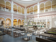
In order to achieve the client’s desire for an urban, yet sophisticated atmosphere, RSP looked at three main ideas for the concept. The first was the industrial theme, which can be compared to an existing warehouse or old building. In the case of the Mercato Mall site, the Italian-themed mall already set the scene as backdrop.
|
Contrast ... contemporary furniture against an industrial backdrop . |
The next idea was to define zones by using specific types of finishes such as distressed wood and antique mirror features to house the banquette seating. The area closest to daylight comprises apple green upholstered benches and rustic stone walls with moveable pew bench seating.
In the case of Silicon Oasis Mall, this idea could be implemented with great success.
The third idea was of a ‘Kitchen Corner’, which translated into a modern enclosed form placed within the old industrial space, encouraging customers to focus on the kitchen and juice bar station.
Modern, white and contemporary furniture pieces forms a contrast with the old industrial backdrop together with splashes of apple green and orange that give further depth to the space. The colour accents also emphasise the idea of freshness, which forms a large part of the restaurant experience. The beauty of the space lies in the details and the factory-style display cabinets, designed in a way to house any items, big or small, from greenery to books to products.
|
Taste Kitchen at Silicon Oasis ... informal yet stylish. |
The typical shopfront design has a strong industrial influence, using timber and dark painted metal window frames on a concrete sill. The concrete banner on one side extends up to half of the width of the shopfront and allows for a wide, open entry, which can be closed with a shutter. The logo was proposed to be done in the interior colour palette of fresh apple green, suspended from the concrete panels.
It was important to the client that the three main design principles be manipulated to suit the site conditions, says the spokesman.
The end result celebrates the bold fusion of the unique elements of the sites with the feature elements, fixed finishes and furniture. The concept blends seamlessly into each restaurant and is translated from the main design language to create a unique look for every new restaurant. This allows for each restaurant to develop its own identity, following the core concept and principles set out by the designer.


