Social potpourri
01 November 2016
Stripped of the glamour and glitz, Cocktail Kitchen dwells on the social experience and all things natural – stone, metal and wood
Cocktail Kitchen, a specialist cocktail bar that opened its doors earlier this year in Jumeirah Lakes Tower, stands apart from the typical glamorous Dubai scene as it is a destination that puts social experience at the heart of its design, layout and its hospitality.
In designing the project architects Jonathan Ashmore from the UAE-based practice Anarchitect and Tarik Zaharna from T.ZED Architects, have focused on creating a sequence of spaces over 500 sq m that maximise social interaction as part of the overall experience.
According to the designers, it was important to create a journey and narrative embedded in the project that continually intrigues and invites guests back to engage and enjoy these experiences in a relaxed and beautifully crafted environment.
 |
|
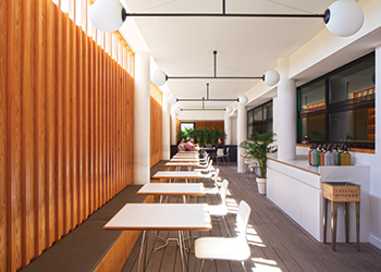
Cocktail Kitchen ... American red oak encloses the ‘outdoor’ dining area. |
At its essence, Cocktail Kitchen has been playful, individual, social and entertaining. But behind all of this lies a passion to instil something that will last and to seed a social culture where regulars, visitors, and new and old faces come to enjoy the environment that has been created and continues to evolve organically. As such, the attention to detail in Cocktail Kitchen extends beyond the attention to craft and material details.
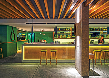
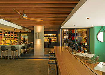
According to Ashmore, the refined material palette is made up of three core elements – stone, metal and wood. “Each in itself respectively represents solidity, precision and nature and when combined they create a superlative refinement and playfulness in the project. The continuity of these core material elements throughout the spaces is intrinsic to the project’s subtlety and character,” he says.
On one side of the 15-m-long white quartz bar, sits the Martini Bar. A feature piece in itself, this area offers a social experience where the mixologist is able to showcase his craft while engaging an audience looking to socialise while experimenting with cocktails on offer. The Martini Bar area is also a second landing space into Cocktail Kitchen for those who are in-the-know and have accessed the venue from the second, discrete entrance.
While the social buzz is encouraged throughout, a more ‘domestic’ side to Cocktail Kitchen is discovered on the opposite side of the main bar. Here, the waiter station is intentionally designed as a domestic kitchen area. While maintaining functionality, customers will feel as though they are in their own kitchen as they walk past this area, which looks into the main cooking kitchen. As such, the waiter station is the perfect transition between the public dining area, and the quieter backroom.
“The sequence of spaces and multiple entry points take people on different journeys through the project. These journeys are intrinsically linked to the social narratives we anticipated, meaning that Cocktail Kitchen has been designed as a multi-layered experience to tailor to each individual experience,” says Zaharna.
 |
|
Cocktail Kitchen ... relaxed and beautifully crafted environment. |
An enclosed ‘outdoor’ dining area is created by using 2.8-m-high natural American red oak slats to create a boundary wall. A 500-mm gap between the soffit and the red oak slats allows for natural light to enter deep into the interior dining space. While offering privacy, and obstructing visibility from outside the venue, the red oak interlock slats recreate the feeling of being outdoors. The natural more reddish colour of the red oak brightens the ‘outdoor’ dining area.
“Users will need to look closely to notice that this outdoor area is, in fact, closed indoor and temperature cooled,” Zaharna emphasises.
While American white oak is used internally, American red oak was used on the outdoor countertops as well as the boundary wall to provide a more natural light glow and to also provide a focal point while standing inside the venue. Externally, the red oak boundary wall will receive most visibility and, therefore, needed to stand out from its context. The letters ‘Cocktail Kitchen’ in copper are mounted externally and back-lit on the red oak slats. During the day, the venue logo, as well as the timber slats, almost match in colour, while at night the logo stands out and an interesting backdrop is provided due to the red oak slats.
“It is important to be relevant in architecture and to critically interpret the brief and anticipate how people will respond and interact with spaces and programmes whilst the project is still only an idea. The client’s brief required us to induce the notion of feeling ‘at home’ by allowing for different levels of privacy and programme to occur. To achieve this through design, the process had to be openly collaborative between client, contractor, consultant and supplier. Each equally important, each was able to significantly contribute to the original vision of the project to realise the space and its potential,” concludes Zaharna.
At a glance
Project Name: Cocktail Kitchen & Bar
Area: 500 sq m
Wood Species: American red oak and white oak
Completed: February 2016
Architects: Jonathan Ashmore (An-architect) and Tarik Al Zaharna (T.ZED Architects)
MEP: Taka Solutions (Charles Blaschke, Christos, Sakizlis)
Contractor: AMBB
Photography: Anarchitect and Sandra Tinari (www.mohken.com)


