Corporate revolution
01 October 2017
Matt Sexton, director of corporate interiors at Perkins+Will, discusses how corporate interiors have evolved over the decades, while Valentina Cereda and Laila Al Yousuf elaborate on how the design firm has responded to the current needs of the corporate sector.
Design has the power to transform lives. It influences us every day, even if we do not realise it. Great design is about problem solving. Take the iPhone, for example; this no longer is just a phone, it has completely transformed the way in which we interact with one another and the world around us.
So how did Steve Jobs and Apple change the world? A commitment to quality and an unwavering pursuit of progress. They threw away the rulebook and asked one simple question: how can design improve our lives?
Within corporate interiors, there are many parallels to this idealism. The question we ask is how can design shape the way we experience the workplace, foster productivity, creativity and connectivity? This philosophy goes beyond aesthetics, it speaks to the fundamentals of how we perceive and subconsciously respond to space. A well-designed space can actually influence our behaviour.
Corporate offices have been a cornerstone of society since the turn of the 20th century, with Frank Lloyd Wright’s Larkin Administration Building in New York, US, revered as the birth of the modern open-plan office. The Larkin Administrative Building contained 1,800 workers, processing 5,000 orders per day working in a central open space at the centre of the building. But how has the modern workplace evolved over the years and does it actually work for the needs of today’s generation?
In simple terms, the answer in no – but of course, nothing is simple…
 |
|
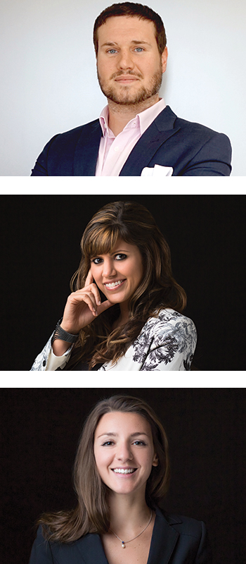
From Top: Sexton, Al Yousuf and Cereda ... office talk. |
Offices have followed a somewhat formulaic approach for decades, exploring multiple iterations of a singular concept. In the 1950s, the concept dubbed Bürolandschaft (literal translation: ‘office landscape’) used organic groupings of desks in patterns designed to encourage conversation and create a more collaborative workforce. It was at this point that the emphasis shifted away from hierarchy and more towards social interaction.
By the 1970s, cubicles were invented as a way to introduce some privacy back into the workplace.
The turn of the 21s century saw the influx of the millennials and with it came the introduction of the coffee shop culture. With modern technology supporting a “work anywhere, anytime” ideology, businesses started to realise that staff morale was directly related to productivity and consequently, the boundaries between work and social life coincided.
Today’s open-plan office still follows the same principals established many decades ago, however there is a greater emphasis on a sense of community with a multitude of spaces dedicated to task-related working. The introduction of collaboration areas, phone booths and multifunctional breakout areas support the ever-evolving complexities of today’s businesses, but the impact real estate prices have had on office design – especially within established markets such as London, New York and Dubai – cannot be ignored. The need for efficiencies and better space utilisation has, in many ways, driven space diversification.
The modern workplace – although evolved – is showing significant failings. Miscellaneous noise, a lack of privacy and other distractions seem to be the worst offenders. A lack of boundaries has reprogrammed inter-office relationships, allowing colleagues to be interrupted frequently which, in turn, negatively affects their ability to perform complex tasks.
Studies from the University of California and the University of London have shown, on average within an open-plan environment, we are interrupted every 11 minutes. Furthermore, it takes 23 minutes to get back to a level of focus where one is deeply engaged. This, in turn, has led to employees consciously separating themselves from their co-workers in order to concentrate.
The fundamental purpose of why we bring people together and the desired outcome of doing so is as relevant today as it was decades ago. Employees are at the centre of office design and businesses are starting to understand that their main value lies with the people that produce.
The key to the future is to understand the needs and requirements of the individuals and the collective, to cultivate growth, foster collaboration and to retain staff. The forum within where this takes place, although must be intuitive, is very much secondary to the occupants.
As corporate office designers, Perkins+Will is committed to progress and understand the complexities of today’s workforce. With the ever-evolving advances in technology and the global marketplace becoming more and more accessible, a “one-size-fits-all” solution is no longer the answer.
 |
|
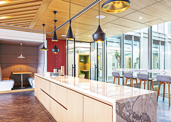
Pinsent Masons wanted a design that was open, transparent and elegant. |
It’s time now to throw away the rulebook, and start thinking about the workplace of the future – an environment where your international colleagues can “sit next to you” whilst still in another country, where individual working and team working can flip back and forth without changing seats, where offices can produce the energy required, generated from the staff themselves.
As Steve Jobs once said, “Design is not just what it looks like and feels like. Design is how it works.” And how it works, has changed.
So how has Perkins+Will translated this concept in its projects in the region such as the LinkedIn and Pinsent Masons offices in the UAE?
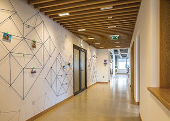
Commenting on the LinkedIn premises, Valentina Cereda of Perkins+Wills says: “LinkedIn wanted an office space that represented the brand but was ‘locally themed’, complete with a regional influence. The company also wished to create a working environment that made people feel happy and proud they work there – a place to look forward to spending time in. There was also a requirement for everything to be open plan, in line with LinkedIn’s global policy, which presented its own set of challenges when it came to creating that ‘welcoming’ atmosphere.”
To achieve this, Perkins+Will got to know the company inside out, holding multiple workshops and meetings, not only with the UAE regional office but with the US headquarters too. “It was vitally important that we got under the skin of that business, learned what makes it tick, closely examining the methods used by LinkedIn to deal with its own people and its users around the world. This is a process we always try to follow, I cannot express how fundamental the difference can be when a client enables this,” she says.
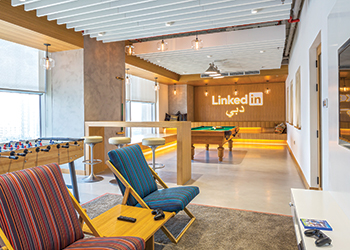
With LinkedIn generally known as ‘a social media platform for business’, Perkins+Will put an emphasis on the social side when conceptualising the new Dubai office space. The office space covers three individual floors, and the company worked to give each one something unique. “One floor, for example, has a games room and a coffee shop where people can socialise with one another,” she says.
“By going through the process of truly understanding the client, we made sure the designs were internally inspired rather than externally. We followed LinkedIn’s global style and vibe, ultimately mixing LinkedIn’s own trends and hand-picking current trends that fit well,” Cereda adds.
Elaborating on Pinsent Masons’ office in the UAE, Laila Al Yousuf, senior project designer at Perkins+Will, says the law firm which has offices worldwide, prides itself on being “approachable, bold, and connected”. The firm wanted a design that was open, transparent and elegant.
 |
|
LinkedIn’s Dubai office... local themes add colour to the brand’s identity. |
One of the largest design challenges was the brief to provide “offices that weren’t offices” to the partners, to find a way to give its partners the privacy that they required, she says.
“Through careful planning of the layout, we maximised the natural light in the building but designed an ‘open plan office’ that was spatially separated by a band of meeting rooms and central facility zones, such as printer and refreshment points. These spaces were then sensibly designed with glass to let the natural light pass through, acoustic panels to absorb any sound transfer, and plenty of storage that gave the partners privacy and functionally, as well as the storage they didn’t have in their previous offices,” she explains.
Also key to the design was ensuring there were meeting rooms both for meetings with clients and to support the staff. We also designed a café that was flexible for large town halls with the AV equipment to support.
“The last critical element to the design was ensuring that there was enough flexibility in the layout to provide staff visiting from other offices a place to work. This was done through several seating booths around the office that are equipped for them to work from as touchdown spaces,” Al Yousuf says.
“Pinsent Masons needed to be open, approachable, bold and connected. They were moving into a premier building with Leed (Leadership in Energy and Environmental Design) certification and they wanted to introduce this into their design as well. The design for the partner spaces, as well as including enough support spaces and still ensuring everyone was connected was a key element. The layout design maximised this and still provided ample natural light to the office,” she explains.
“We are seeing more and more of a shift to open-plan office space, particularly within this region. But the key element here is ensuring that, even if staff are sitting in open plan, there are still enough support spaces that afford people the opportunity of working away from their desks, or meeting in less traditional environments than meeting rooms,” she concludes.


